Lets start with using the Fill Tool to fill the entire area with GRASS15. Then shape your terrain into the the small hills and hollows that are needed. Use the Raise and Lower Tools. 3x3 and 6x6, 15% with a few clicks and short strokes will usally look good. For longer and bigger parts use your Flatten Tool 15%. Watch out for too crazy hight differences! Place a human creature in your landscape and a reference and ask yourself if it looks okay.
Now place your trees. Not to many, be carefull with using more than a couple types and be stint with how many seeds you use.
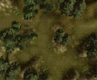
Next, paint the areas under the trees with GRASS11. 80% under the stems for a fallen leaf/needle look. Use 50% to smoth it out around the darker spots. In this image the GRASS11 is replaced with Black shades.
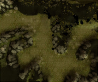
Now we go for the rocks. Hide the trees and use CLIFF04 to lift up the rock face from the grassy grounds here and there. It's best used on the slopes and where you have sharp edges. You can also use it on the ground where rain and wind would have abrade the rock. Use 2x3 50% for clearly visible rock and 1x2 25% for a blended look. You see that the grass shines through a bit in the Black spots this image.
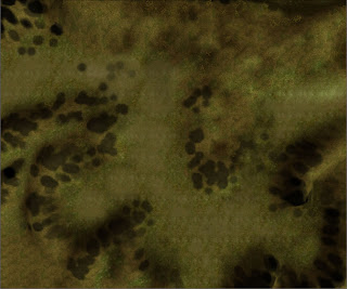
The rocks now looks lik stains on the ground so we'll make some grass stone combination, GRASS01 1x2 25% and 15% grow over the edges. Use this mainly on the lower parts of your rock textures as in this image.
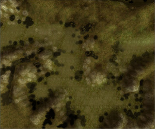
Now we're on to the last part which is a path or lower ground texture. It's a mix of small pebbles and grass, GRASS04, which we use in the bottom of the hollows. Use it carefully with larger dot's of 50%, some smaller of 80% and a little random strokes of small 25%. Like this:
Now take a look at your area with trees visible. The "path" is probably to sharp in the edges and need to be jagged by some GRASS15 80%. There's problably also too little of the leafy GRASS11 under your trees. It starts to look good, isn't it?
Okay, on to the final and most important touch, the color shading. Select the Color Tool. Use a 2x2 30% brush with a grey color. I use the first one from the left in the second row. Now click a couple of times under the trees to give a stronger impression of the absence of light. Enhance the rock slopes and ground pans with darker strokes. Look for repeating textures and break them upp with a few clicks and strokes. It takes some practise so use CTRL-Z and CTRL-Y often to compare and undo. Then shift color to the brown one, the first on the left at the last row. Make the ground around the trees more brownish. Go over the grass here and there and use the color to darken spots where the grass grows thicker or around rocks to make them look a bit dirty and earthy.
Now you should have something like this:
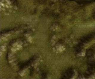
Now you can place your grass. Don't make it too thick 20-25% density will do. Compare the grass height with your reference creature. Where I live there's no grass grows 1.5 meters high in the woods :) If you look carefully in the black areas in this image you see the grass shining trough. Overdoing it will make your area heavy and slow. Then the players will turn down the visual goodies and they won't see your grass at all.

Place your placeables. The stonepiles, the fallen trees. And of course the animals, sounds, encounters etc.
Good luck!
Amraphael
[EDIT]
Wow, I spell like I'm like five years old :)
Tomorrow I have a spell checked PDF up at the NWVault.


5 comments:
Great tutorial. I'm sure many will find it very helpful.
This looks great. I will be using this in the next few weeks.
This is a pretty good tut. I made a forest before for a server I help out with occasionally. Never again :) They're far too draining to make. Think it took me around 1 month of dragging my feet only for someone else to butcher the poor thing :(
I'm sure many people will find this very useful.
PS. I noticed you went with the Obsidian forest look.
Thank you guys, I noticed that I've left out one image but the PDF is under approval at the Vault and it's more easliy accessed there. I've corrected some typos and syntax things too.
If a new toolset user follow it once, s/he should be able to do a similar area 12x12 in a hour or less, and would easily start with other types of textured areas. Beaches, Mountains etc.
Yup, I think there's a reason why OEI selected those textures. They mix together very well in a forest -like area. I've tried to use the swapper to make a autumn version, an oasis and a snow landcape. It works well if you just select the textures carefully.
You have done a great job of dissecting the OC module and sharing your findings in a clear and concise fashion!
I wish everybody writing tutorials for NWN2's toolset understood that they need to write down to the lowest level of expertise or risk losing their audience.
Thank you!
Post a Comment